-
Shop
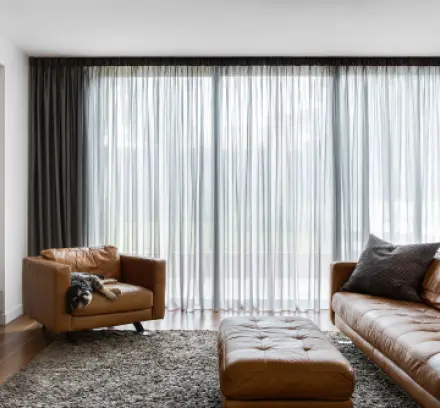
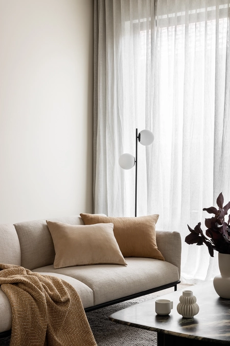
Sheer curtains are light filtering, airy, and versatile
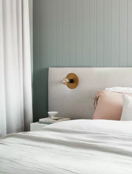
Blockouts are ideal for sleep and privacy
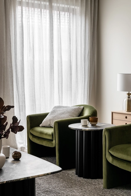
Sheer curtains are light filtering, airy, and versatile
Blockouts are ideal for sleep and privacy
Eloise Webster

Picking out the perfect colour for your curtains can be a super fun adventure! With so many different shades to choose from, it's like being a kid in a candy store. And don't worry, you don't need to be a design guru or colour expert to make the right choice.
The first step is to think about the vibe you want for your space. Do you want your curtains to be a bold statement piece or blend seamlessly with the rest of the room?
Once you have a clear idea of what you want, you're already halfway there!
And let's not forget about the function and style of the room where your curtains will hang out. It's important to choose curtains that not only look great but also fit your practical needs.

If you're all about that modern and minimalist vibe, go for a colour that's similar to your walls or make your curtains a little darker to add some contrast.
But if you want to add some personality and character to your space, think about the mood each colour creates. Warm colours like red, yellow, and orange create a cosy and inviting ambiance - perfect for social areas.
Lighter hues have a stimulating and energizing effect, while darker colours have a more calming effect. Of course, your existing room design will definitely play a role in your colour choices, but don't forget to also consider what you really want.
If your room is pretty neutral, adding a pop of colour through your curtains can really make it pop! But if you already have a focal point like a statement piece of furniture or wallpaper, it's best to choose curtains in neutral or earthy tones so they don't compete. And if you're lucky enough to have an amazing view, choose curtains that blend in and complement it.
If you have an accent colour in your room, matching your curtains to it is a great way to tie everything together.
When it comes to the bedroom, darker hues are perfect for creating a relaxing environment and blocking out any unwanted light.
If your room has tall windows, choosing curtains that are slightly lighter than your main furniture will help avoid any distractions.
Remember, the key to choosing the perfect colour for your curtains is all about matching the mood and style you want in your space.
Just keep it simple and direct - you got this!
Bursts of colour - Adding bursts of vibrant colours to a room can be a fun way to showcase your personality. However, it's not always the best idea when it comes to your bedroom. For a more relaxing and calming ambiance, consider using cool colours such as subtle green or blue instead of a bright and distracting splash of colour that might keep you up all night.
Lighter colours - Want to make your space feel bigger and brighter? Try adding some lighter colours! They give off a soft and elegant vibe that works especially well in living areas or smaller rooms. Just remember, lighter shades are more prone to showing marks or dust. But don't let that discourage you - the benefits of a spacious and bright room are totally worth it!
Darker colours - Bring a touch of sophistication and luxury to any space, while also adding contrast and depth. Although they may make a room feel slightly smaller, lighter colours can make it seem bigger. Just keep in mind that if you place them in direct sunlight, they may fade slightly over time.
Light filtration - Let's talk sheer curtains! The colour you choose can totally change the vibe of your room by affecting the way light comes in. It's a fun way to play with mood and ambiance.
Matching curtains - Want to create a cohesive look in your home? Matching curtains can totally do the trick! If you have a consistent style throughout your home, using curtains of the same colour will make everything look super streamlined and chic. But don't worry if each room has its own vibe - you can totally mix it up and use different curtains that match each décor. It's all about making your home feel like YOU!

Using a colour wheel is an amazing alternative and tool to get started. Simply identify the main colour in the room and use the wheel to discover complementary or analogous colours. This will make your space look incredible and seamlessly put-together.
Analogous Colour Scheme: A super cool way to create a harmonious and visually stunning space by using neighbouring colours on the colour wheel that share the same base colour. And the best part? You can mix and match two or three of these colours to create a bold and striking contrast.
Complementary Colour Scheme: By using colours that are opposite each other on the colour wheel, you can create an impressive high-contrast look that's perfectly balanced. Just remember to make one colour more dominant or use both as accents in a neutral room.
Monochromatic Colour Scheme: An effortless way to create a cohesive look, especially when you're working with varying shades of one colour. Don't forget to match the same hue of décor in the room for a seamless finish!
We'd love to learn more about your project and provide any product + design advice.

Got questions? Our Help Centre has the answers! It's basically Curtains 101 and easy to follow guides.